
Screenshots
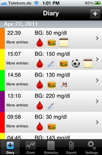
In the diary view you can see all your entrys ordered by date and grouped in days. A click on an entry will show the detailed view.
The icons an each entry directly indicate the saved readings. The coloring on the left side indicates the target ranges of the glucose value.
The icons an each entry directly indicate the saved readings. The coloring on the left side indicates the target ranges of the glucose value.
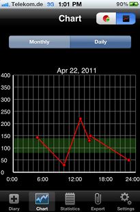
In this line graph you can see your daily readings. You can scroll through the days by wiping horizontally.
You can also see the target range inside you graph, so can easily se which values are fine and which should be better.
You can also see the target range inside you graph, so can easily se which values are fine and which should be better.
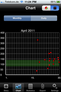
In the monthly line graph you can see all readings grouped by month. It is especially good to see stray bullets, high or low. You can also see all months by wiping horizontally over the graph.
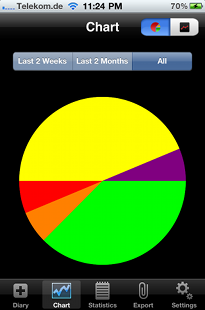
The pie chart show the percentage of readings inside the target glucose area.
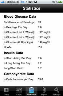
Inside the statistics tab you can see some statistics, which will help you to treat you diabetes a lot better. Average glucose for different timeframes will show you the trend of your diabetes treatment. You can also see your average insuline doses and meals.
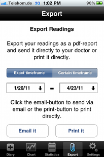
In the export view, you can generate all your diabetes documentation with a single click. You can either select 2 dates for your export, or fixed timeframe.
Clicking the export button will generate the pdf-export and opens the mail view.
Users with iOs 4.2 or higher can use the Print-Button to print the export directly on their AirPrint-printer.
Clicking the export button will generate the pdf-export and opens the mail view.
Users with iOs 4.2 or higher can use the Print-Button to print the export directly on their AirPrint-printer.
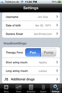
Inside the settings you can add all your personal information which will be used inside the pdf-export.
You can set your insulines and if you use an insuline-pump, the basalprofile will be set here.
You can set your insulines and if you use an insuline-pump, the basalprofile will be set here.
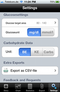
Beside the general and insuline settings you can choose your glucose unit and your target range.
DiabetesPlus gives you the possibility to enter meals in 3 different units. Users which like to make their own excel exports, all entrys can be exported to a csv-file here.
DiabetesPlus gives you the possibility to enter meals in 3 different units. Users which like to make their own excel exports, all entrys can be exported to a csv-file here.